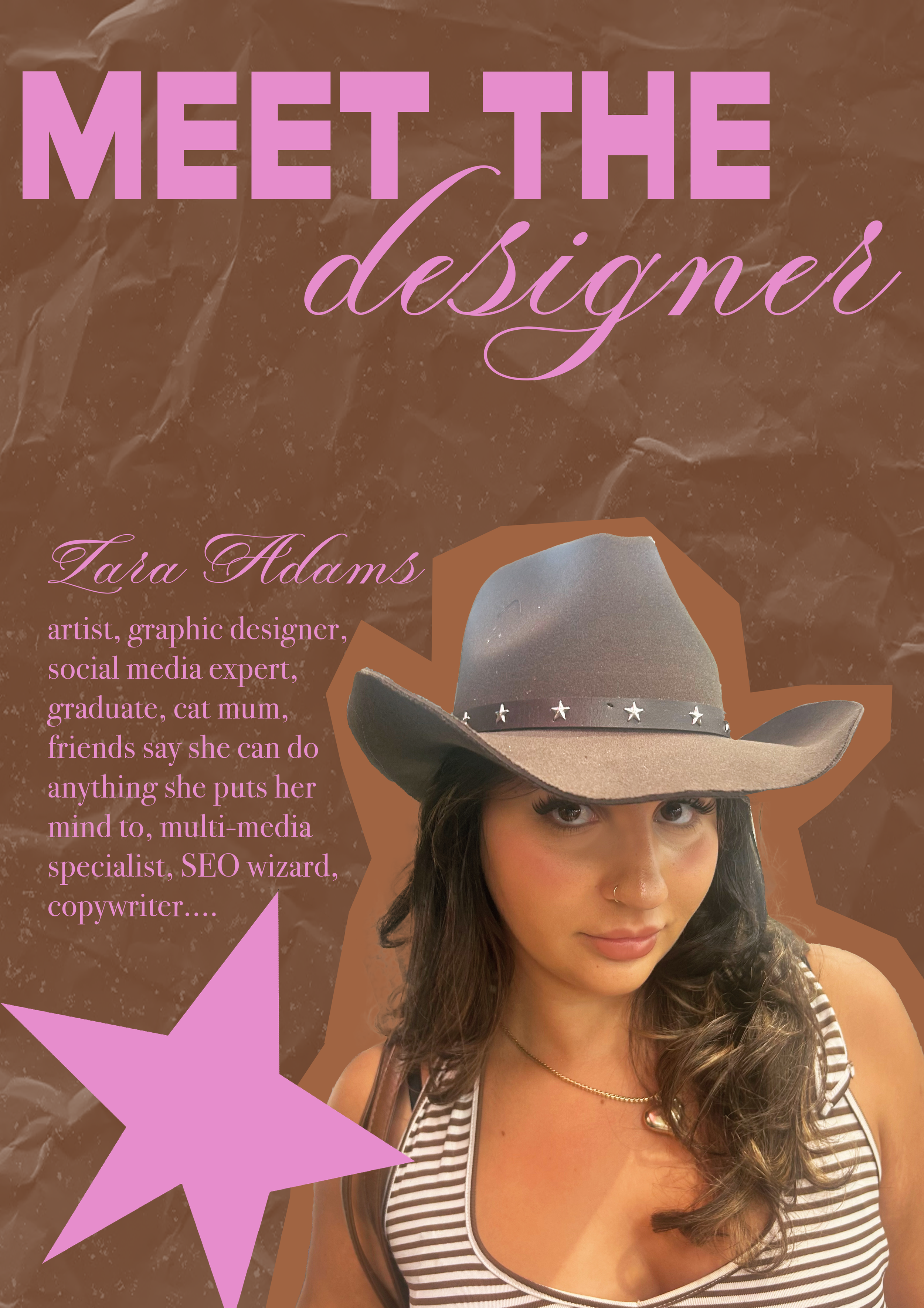
Projects
This portfolio brings together selected projects from my experience in graphic design, photography, and media. It includes client work, university briefs, and self-initiated pieces that highlight my skills in visual communication, digital design, and creative strategy.
Each project showcases a different aspect of my process, from concept development to final execution, across print, digital, and social formats.
The Human Rights Game
The Human Rights Game is an educational board game designed to teach young people about their fundamental rights, freedoms, and responsibilities. Developed in collaboration with educator Andrea Chorney and The Brainary, the game is grounded in the 30 Articles of the Universal Declaration of Human Rights, with a focus on the values of freedom, equality, and dignity.
I was responsible for the full visual design of the game, including the board, cards, and packaging, working across Illustrator and Photoshop to create a bold, accessible, and engaging look that appeals to a younger audience while maintaining clarity and educational value.
Now distributed globally and available at the United Nations Headquarters in New York, The Human Rights Game is used in classrooms, therapy settings, and homes to support inclusive education, empathy-building, and human rights awareness.


Star and Lar
At Star and Lar, I led a complete digital and in-store transformation for the business. My role involved creating a brand-new visual identity, including a logo set, and establishing a consistent online presence through branding, product photography, and social media.
I designed and launched their first eCommerce website, replacing handwritten receipts with a modern POS and stocktake system to streamline operations. I also individually categorised and uploaded the entire product range, from bras to shape-wear, ensuring a smooth customer experience. The blueprint I developed allowed retail staff to continue running the online side of the business independently after my time there.
This project was a hands-on blend of creative direction, digital design, and strategic problem-solving, bringing a small, local brand into the modern retail space.
Note: Star and Lar has since closed, so the website is no longer live.
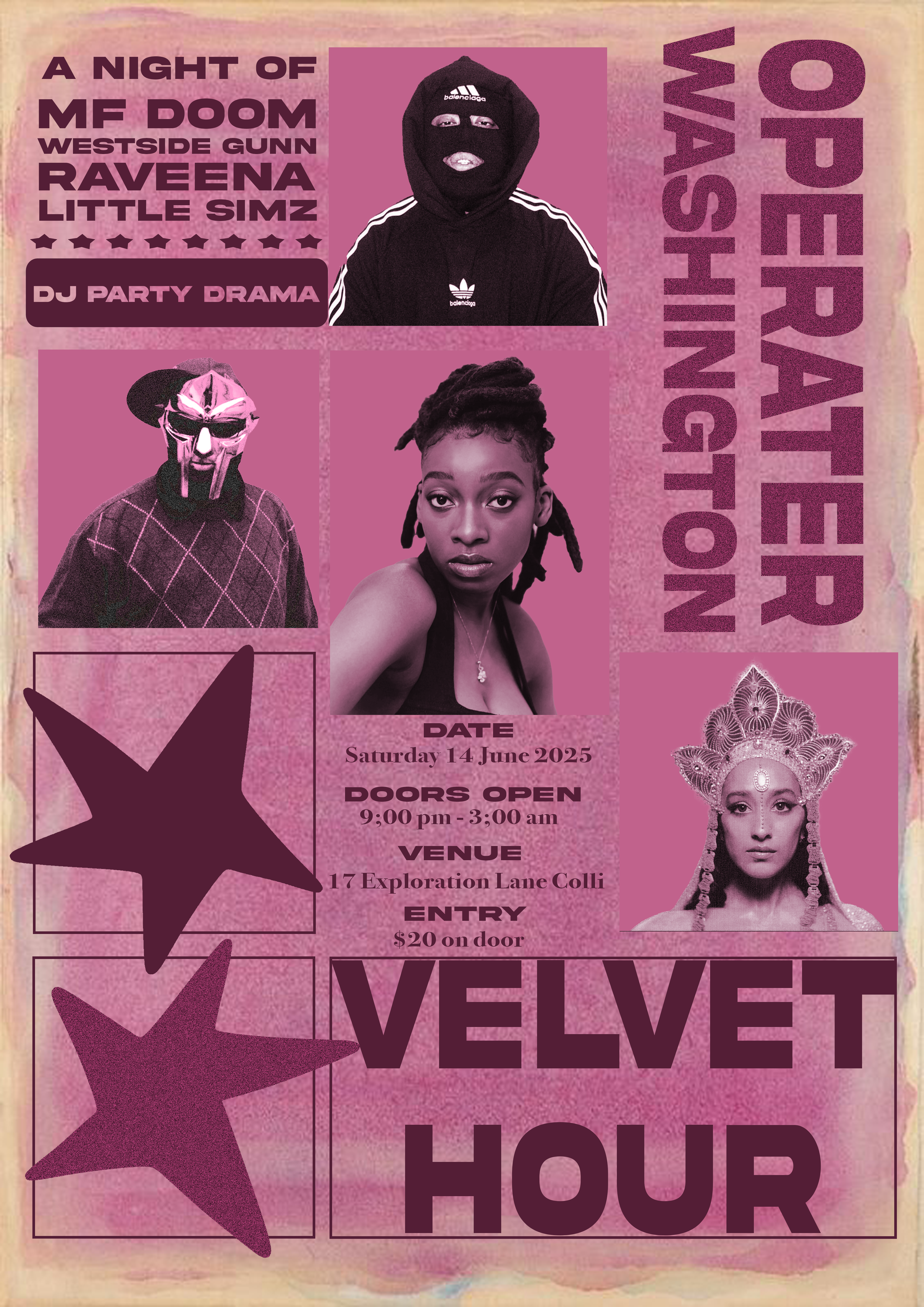
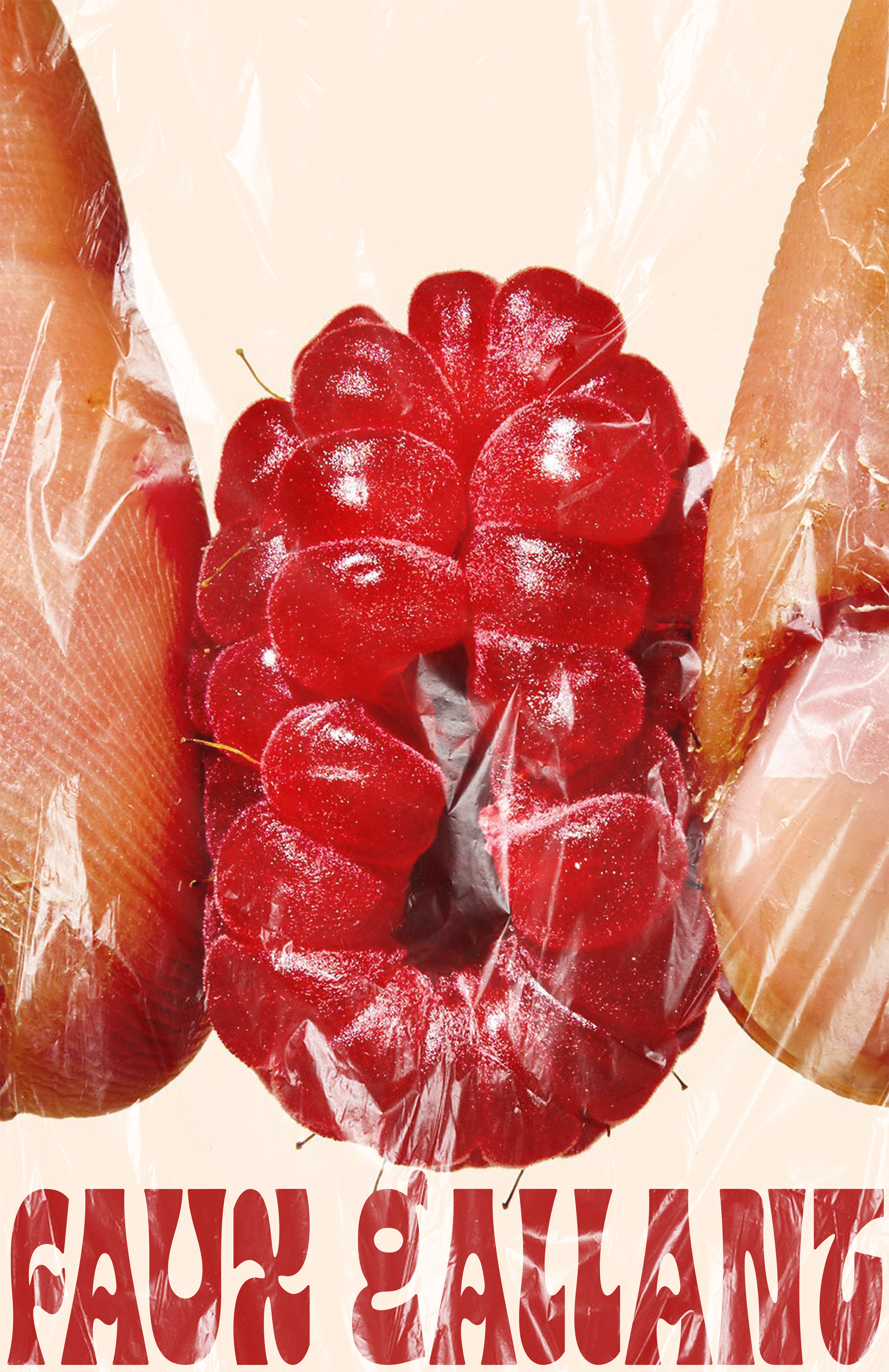
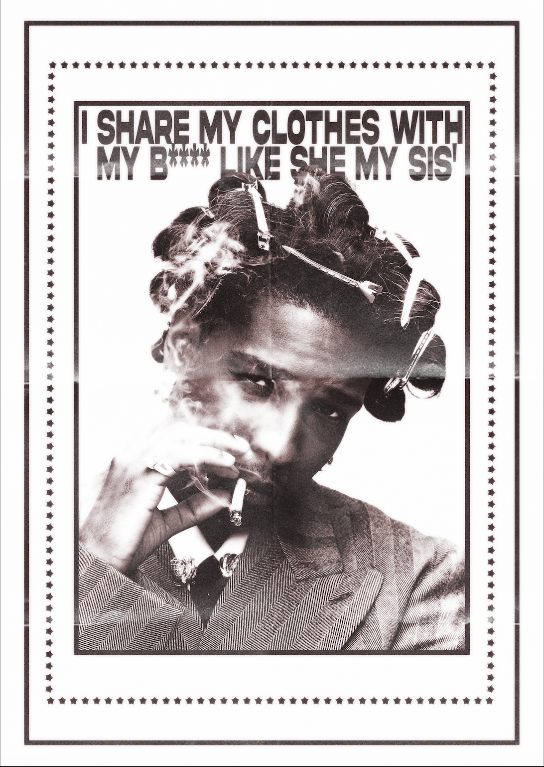
Posters
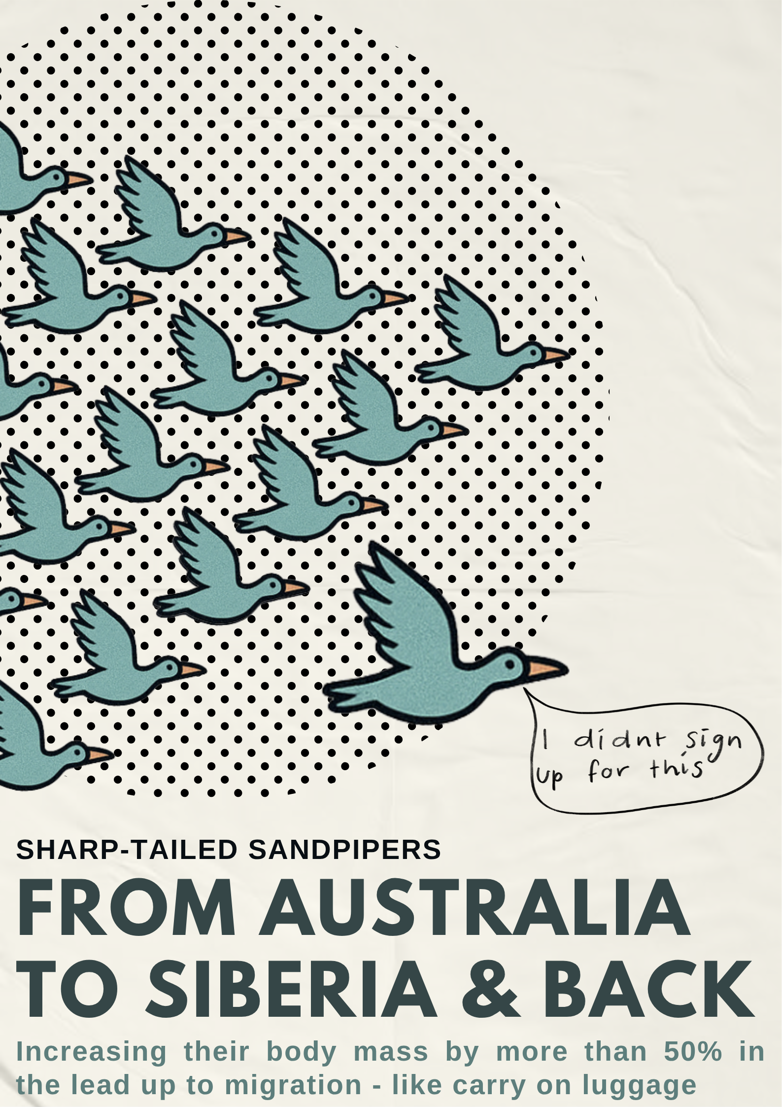
Mott, R. (2023). Migratory Birds. Bush Heritage Australia.


Benalla Rural City Council. (2025). FlameFest.

Nilsson, H. (1971). Coconut.
IKEA (2025)
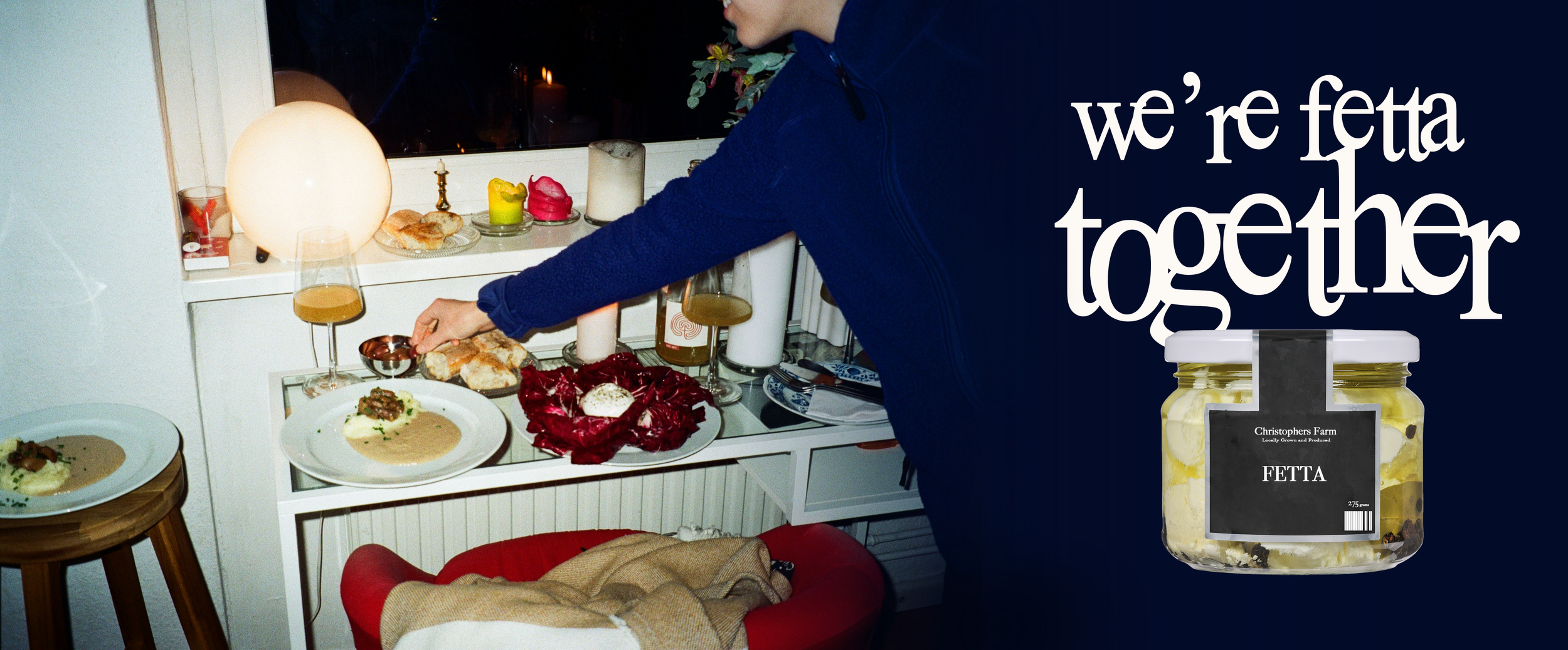
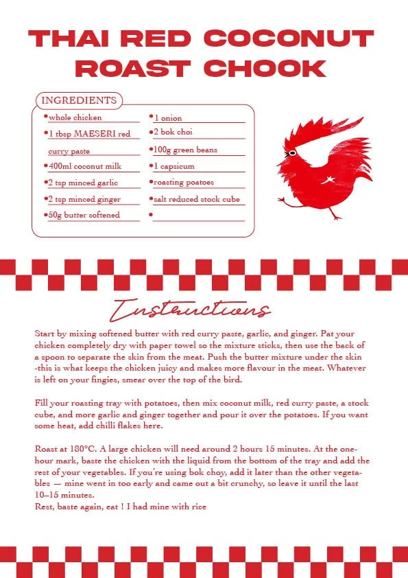
this is a recipe I made up and distributed to me friends and mother, try it out, its yum !

Heron (1971)
Logos
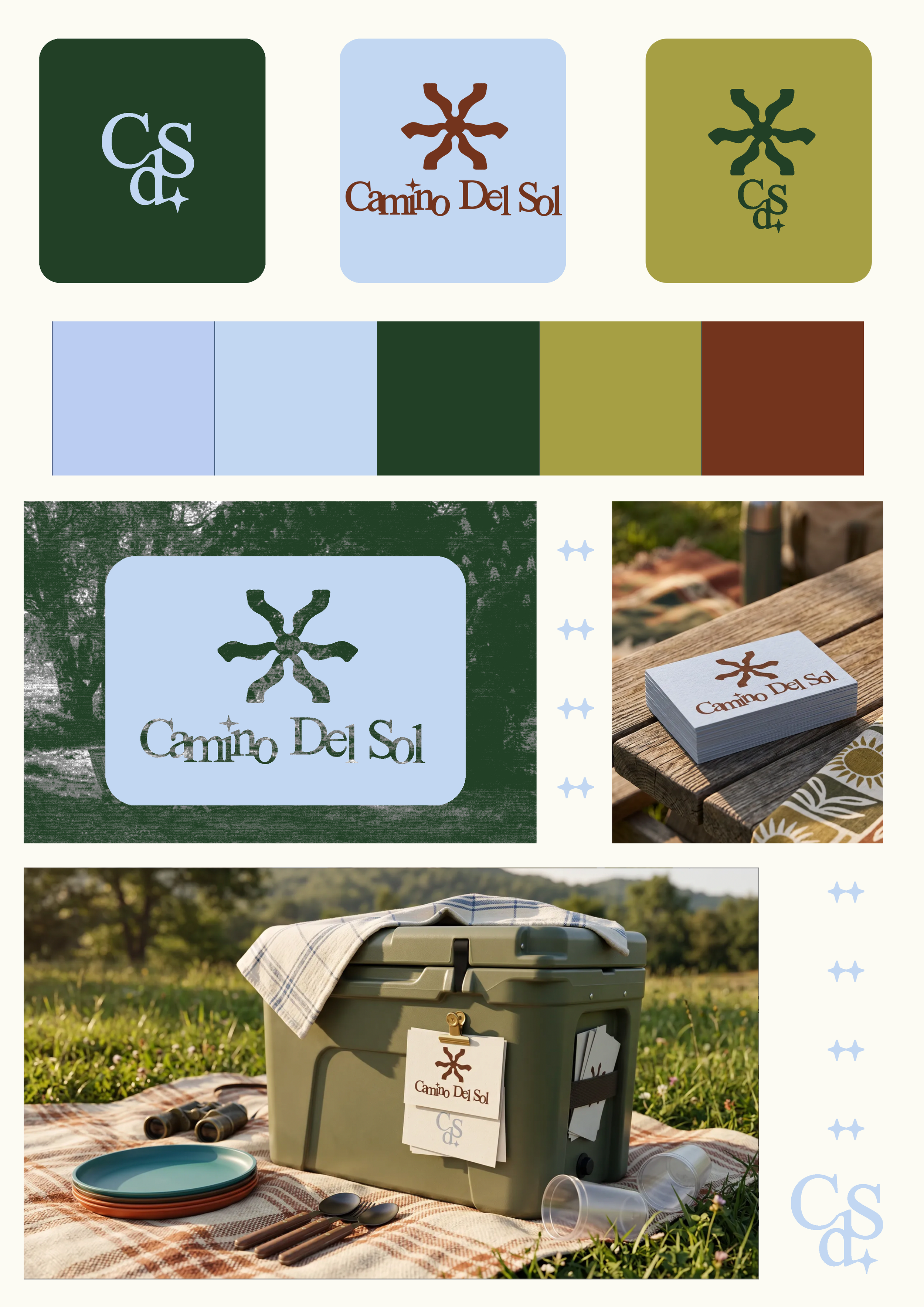
Camino Del Sol
Camino Del Sol is a concept outdoor accessories brand developed as a full brand identity project. The name, Spanish for path to the sun, directly informed the mark, which began as a single image of a sun-lit path, rotated and layered until it resolved into a radial sun symbol. The palette draws from the landscapes the brand inhabits: forest green, olive, sky blue, and burnt terracotta, earthy and modern without defaulting to the rugged clichés of outdoor design. Applied across packaging, stationery, and product, the identity has enough range to live on a cooler in a paddock or a business card on a timber table.
Nomi Club
Created in response to a brief for a modern, edgy food collective, this logo balances boldness with simplicity. The aim was to reflect a youthful, no-fuss attitude, something fresh, confident, and slightly rebellious. Fun serif typography and sharp shapes give it a contemporary edge, designed to stand out across digital and physical platforms.


Blossom and Root
This logo was designed as a conceptual piece for a flower delivery service. The brief called for something soft yet grounded, capturing both the delicate nature of flowers (blossom) and the stability of their origin (root). The design combines organic forms with clean, typography to create a visual identity that feels fresh, approachable, and quietly refined.

Get Into Golf
This logo was created as part of a university project focused on branding and sport marketing. The brief required developing a campaign identity to promote community engagement in recreational activities. Inspired by timeless elegance and tradition, Get Into Golf reflects accessibility, sophistication, and the welcoming spirit of the sport in Greater Melbourne.
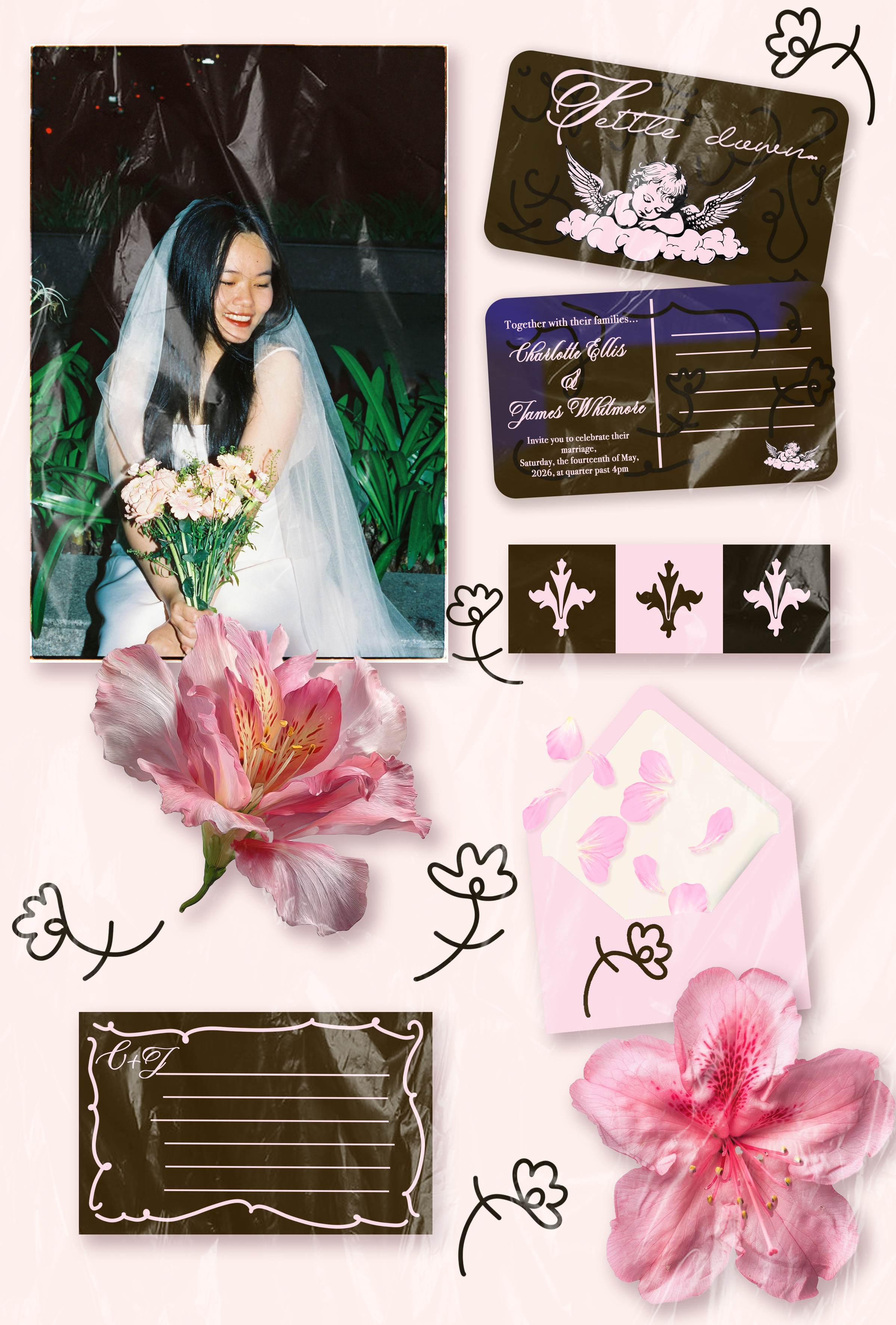
Not a Logo - Wedding invite

Model Clinic
The colour palette combines deep green, blush pink, and warm neutrals to create a modern yet approachable aesthetic. Green communicates trust, professionalism, and calm, while pink adds softness and femininity. The gradient backgrounds and balanced contrast help highlight transformations, giving the brand a polished, confident, and inviting feel for clients.
Instagram & Video Content
My art Instagram account is both a creative outlet and an extension of my professional practice. It’s a space where I explore visual storytelling, experiment with style, and express ideas freely, while also staying actively engaged with the digital landscape.
Alongside the creative side, the account allows me to continuously develop and maintain practical skills across content creation and digital marketing. I regularly edit short-form video, adapt content to platform trends, test formats, and track performance metrics to understand what resonates with audiences. This process helps me refine my approach to pacing, visual hooks, and storytelling in a fast-moving social environment.
By combining personal expression with intentional content strategy, the account acts as a living portfolio, one that reflects both my creative voice and my ability to create, iterate, and grow content in a real-world, performance-driven context.
Check it out here ! laraadamsmadeig
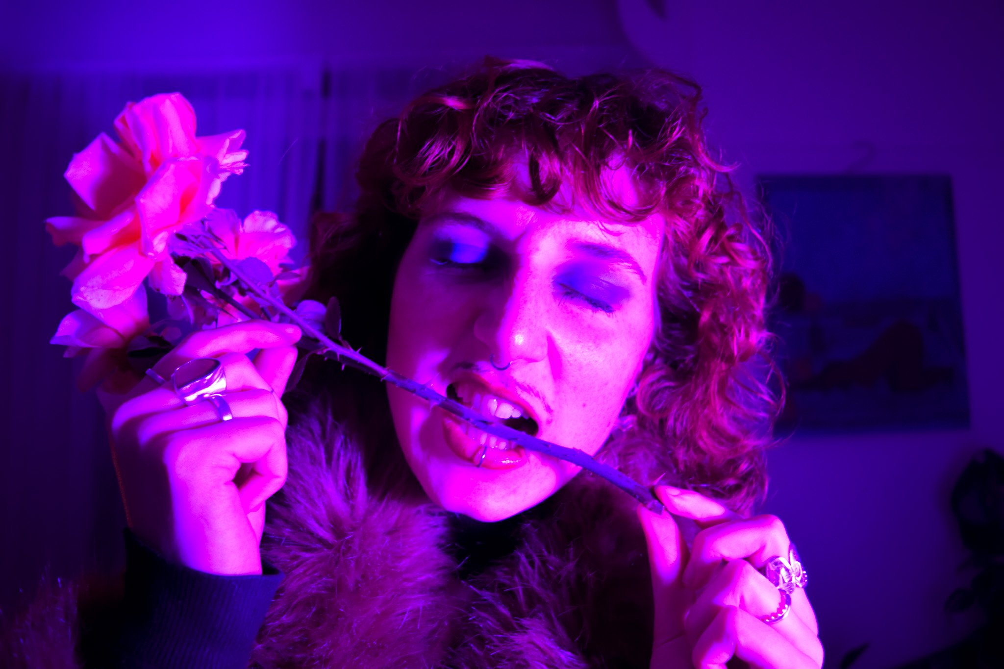
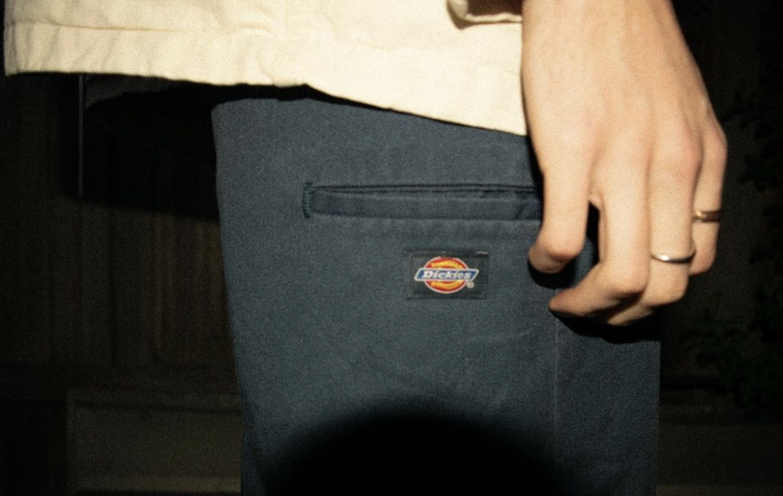
Photography
3D Sketching - Product Design


